An old friend recently asked me to create a custom painting based on a John Donne poem, "A Valediction: Forbidding Mourning." In this post I'll walk you through the inspiration I drew from the poem to create the final image I painted and how, through many draft paintings, I moved from an idea in my head to a final painting. I've also created a tutorial detailing the specific watercolor technique I used for the final image. If you want to read about that click here.
STEP ONE: DRAWING INSPIRATION FROM A 17TH CENTURY POEM
The first step for me was to understand the poem so I could draw inspiration that I could use to create a watercolor painting. The poem is lovely but, admittedly, it took me a while to figure out what it meant (shout out to shmoop.com for helping a girl out). Once I understood the poem I was drawn to the imagery of the third sixth stanzas and was able to create a custom watercolor based on this gorgeous poem.
Take a read for yourself:
A Valediction: Forbidding Mourning
John Donne, 1611
As virtuous men pass mildly away,
And whisper to their souls to go,
Whilst some of their sad friends do say
The breath goes now, and some say, No:
So let us melt, and make no noise,
No tear-floods, nor sigh-tempests move;
'Twere profanation of our joys
To tell the laity our love.
Moving of th' earth brings harms and fears,
Men reckon what it did, and meant;
But trepidation of the spheres,
Though greater far, is innocent.
Dull sublunary lovers' love
(Whose soul is sense) cannot admit
Absence, because it doth remove
Those things which elemented it.
But we by a love so much refined,
That our selves know not what it is,
Inter-assured of the mind,
Care less, eyes, lips, and hands to miss.
Our two souls therefore, which are one,
Though I must go, endure not yet
A breach, but an expansion,
Like gold to airy thinness beat.
If they be two, they are two so
As stiff twin compasses are two;
Thy soul, the fixed foot, makes no show
To move, but doth, if the other do.
And though it in the center sit,
Yet when the other far doth roam,
It leans and hearkens after it,
And grows erect, as that comes home.
Such wilt thou be to me, who must,
Like th' other foot, obliquely run;
Thy firmness makes my circle just,
And makes me end where I begun.
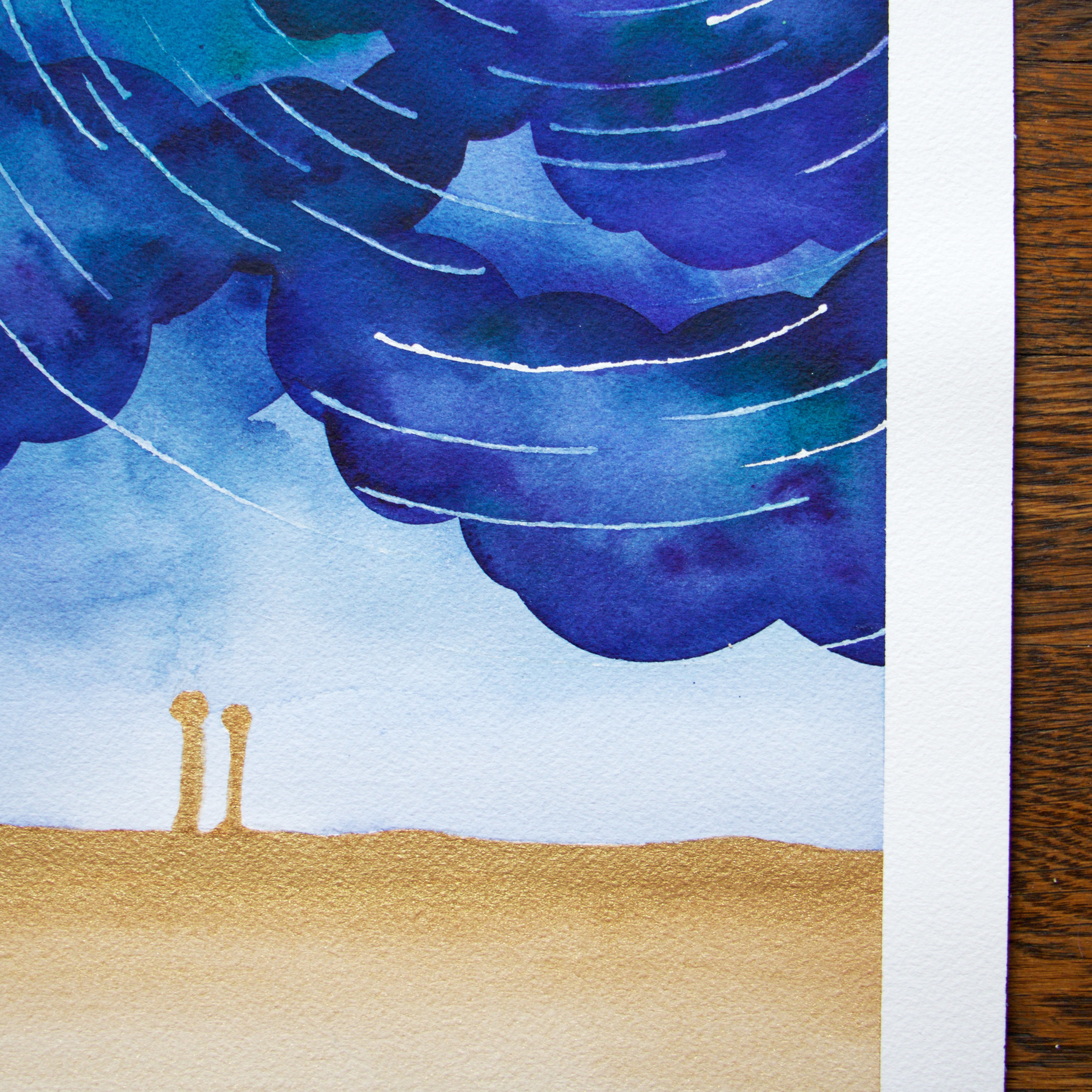
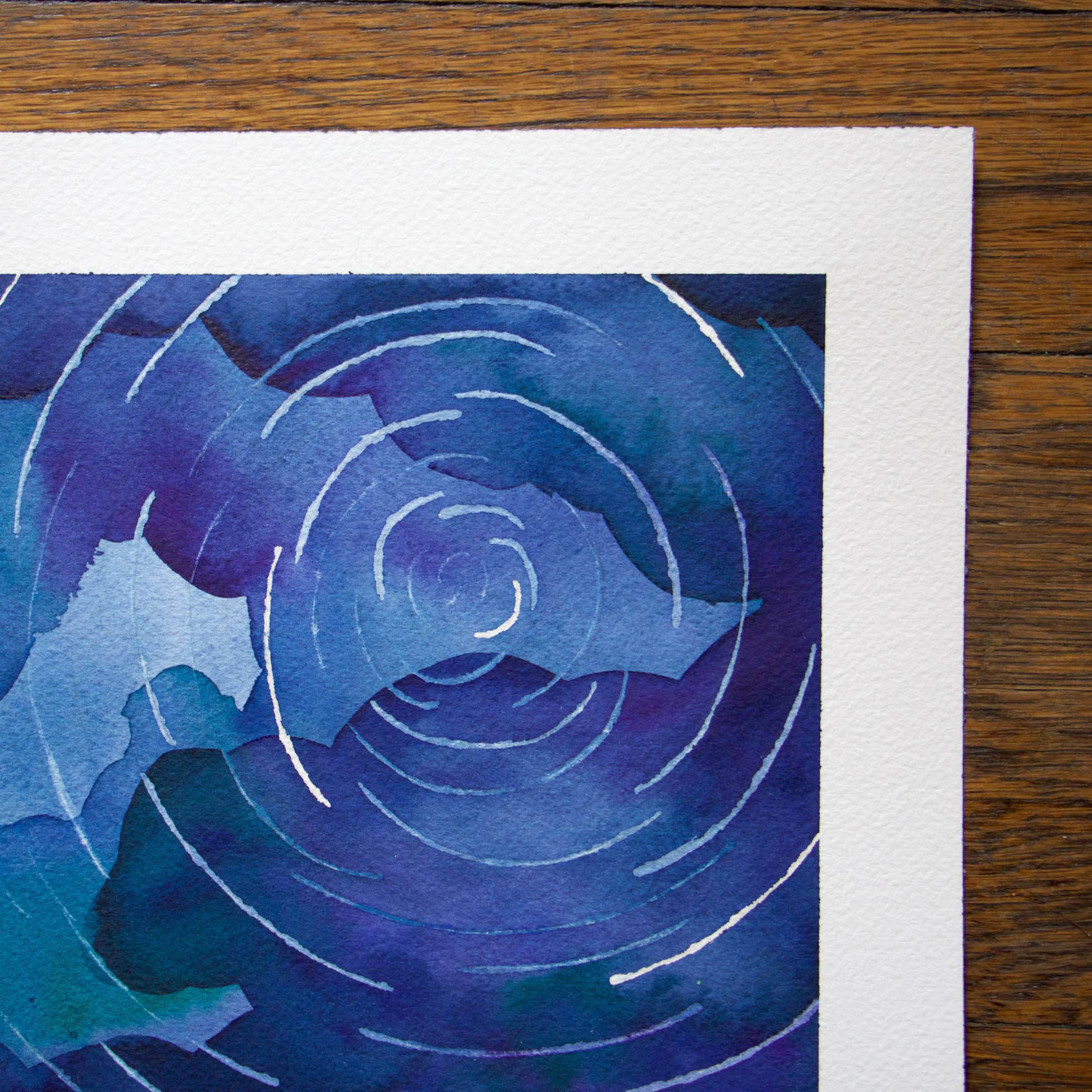
The “trepidation of the spheres” line in the third stanza was the main inspiration for the painting I created. I wanted to illustrate the motion of the stars in a similar way a long exposure photograph captures the night sky. The “like gold to airy thinness beat” expression was so beautiful and I’ll reference Shmoop’s easy-to-understand explanation: “Gold is a soft metal, easy to hammer and work with. It can be hammered ("beat") into super-fine gold foil, and a little bit can go along way. Where other metals or materials would break when you stretched or beat them, gold retains its "one-ness," even across a great distance.” How lovely. The gold wash at the bottom of the painting represents that line and overall idea.
STEP TWO: CREATING A PHYSICAL PAINTING BASED ON MY INSPIRATION
The second step was taking the ideas I had from the specific lines in the poem and creating a watercolor painting. I knew how I wanted it to look but it took some trial-and-error to come up with a technique to execute the image I had in my mind. I drafted images for days and finally came up with a composition I really liked and wanted to bring to life with watercolor. Creating a physical product based on an idea or sketch can be extremely difficult and time consuming so I took a lot of care in the beginning stages to ensure that once I started painting I just had to worry about technique and execution, not composition or overall design. When I settled on an overall design idea I did a few test runs of the painting based on my ideas and, as you can see, it was rough going at first.
It took me three tries to get a final result I was happy with. Third time's a charm!
Now that you've seen the overall design process I'll walk you through the specific versions I created that eventually led to the final painting.
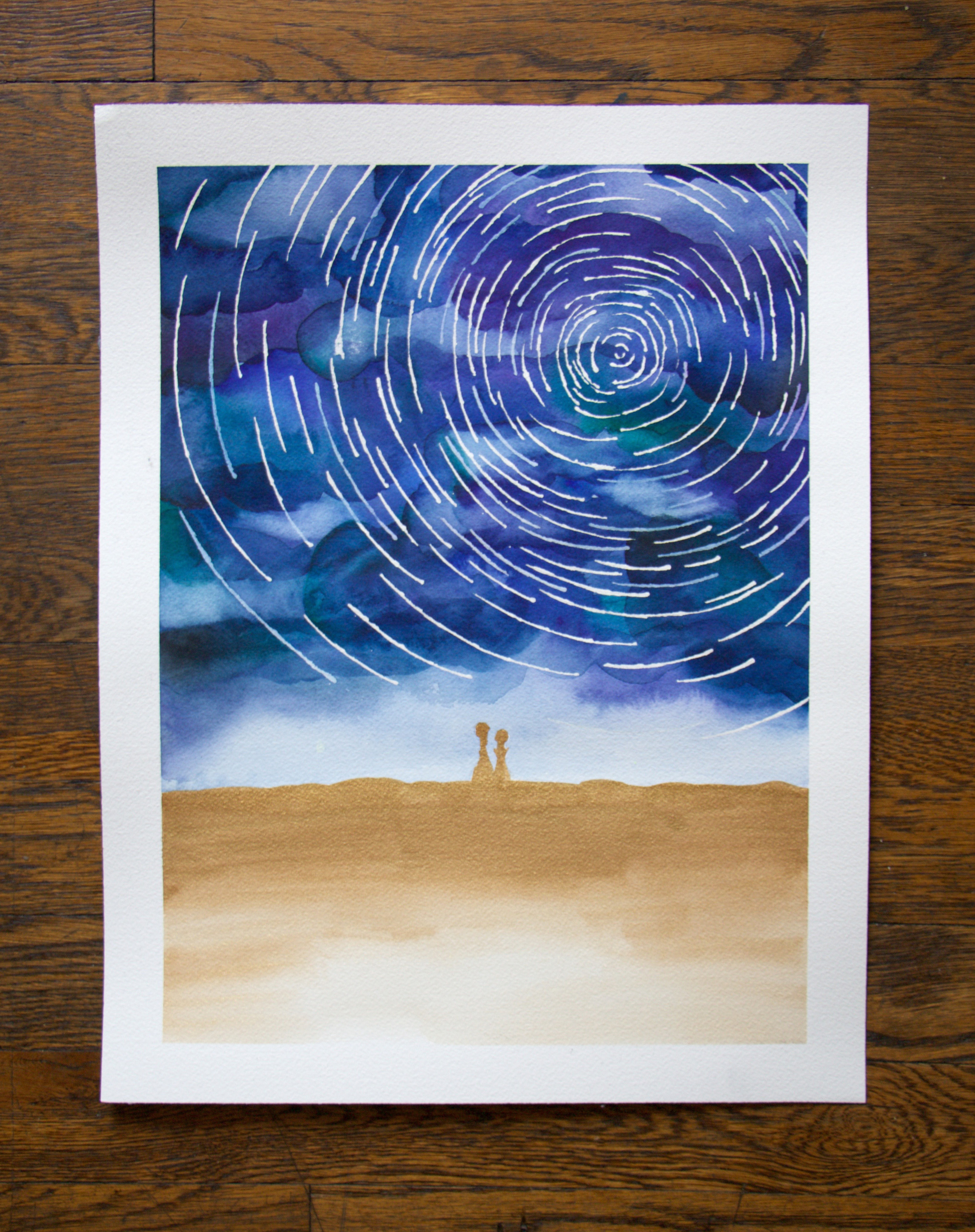
The general idea remained the same but the sky, the focus of the piece, was very rough at first. The solution I found was layering the watercolor clouds and using masking fluid to create the stars. You can see the short masking fluid lines and clouds that aren’t layered very well in my first draft painting (photo below). I tried to do the sky in one layer but I had to be careful that the clouds didn’t actually touch so they wouldn't bleed together. They ended up looking disconnected and weird.
Attempt #1 at my night sky. The cloud layering and masking-fluid star technique isn't quite there yet.
In the second draft I made longer masking-fluid star lines which I thought looked better but I painted them on first so they were bright white in the end. I wanted the sky to be the main focus and this technique made the stars too loud. There were also too many stars in this draft which also overwhelmed the clouds. The sky improved a lot in this draft because I painted it in layers instead of trying to do it all at once. I let each layer dry completely before painting the next, with each layer getting a little darker than the one before. I’ve learned patience is key when it comes to watercolor painting.
Attempt #2 at my night sky. The cloud layering is getting there but there are too many stars and they are too bright.
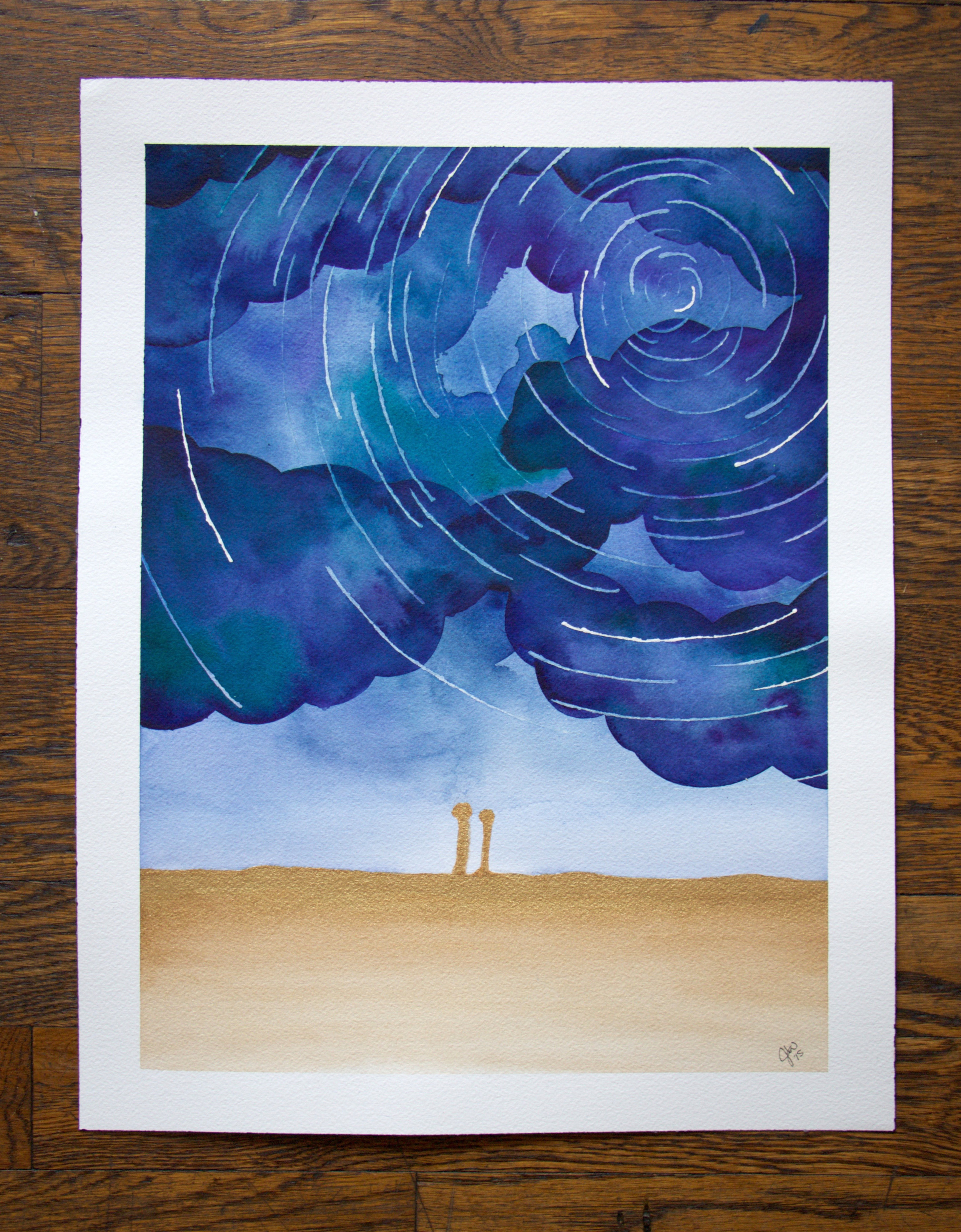
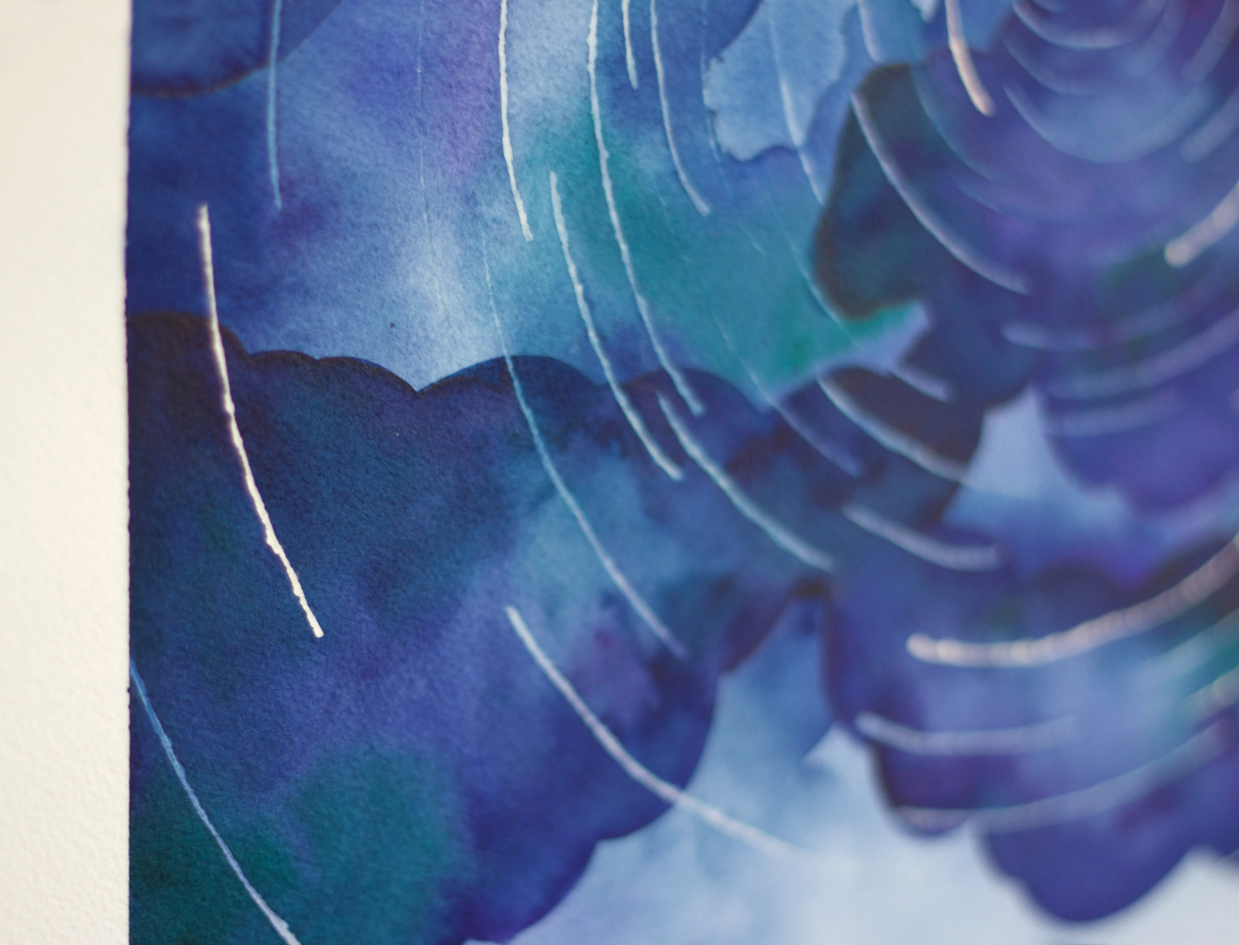
After two attempts at my night sky I reassessed the problem areas. I wanted the clouds to really stand out so I came up with a new process. The third and final painting was vastly improved by alternating "star” and “cloud” layers and reducing the number of masking fluid lines. This allowed for the sky to really stand out. I also reduced the number of cloud layers to four, instead of about ten in the previous draft. If you want to more about the specifics of this technique I have a tutorial dedicated to just the watercolor sky process here.
The third and final painting. Alternating cloud and star layers helped create a cohesive and beautiful sky.
And there you have it! A night sky watercolor inspired by a 17th century English poet.
Click here for a tutorial that walks you through the specific details of creating this night sky.
If you have any questions shoot me an email at paperbyjlee@gmail.com. Have an idea for your own custom watercolor? Email me at paperbyjlee@gmail.com and we'll get started!
